
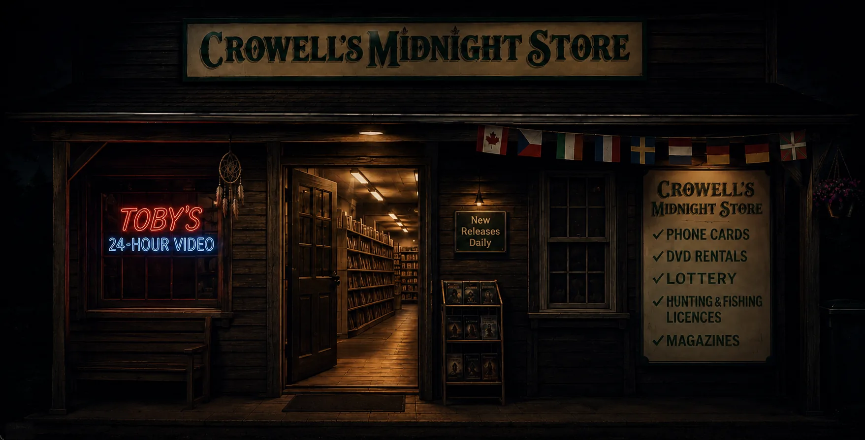
Personal project · 6,000 films · Zero budget
Tobytube
Feeding passion with spite.
Before you ask
“We’re a finance company. What the hell does a media player have to do with finance?”
Hold on, bro. I’m way ahead of you.
What you have are multiple diverse services that you want to live under one roof. Your services handle various categories of data, with the end goal of helping the user find what they need easily and efficiently.
“But movies are completely different from what we do at [your company name here]!”
That is ego talking. I don’t do ego over here.
I fix problems.
Context, or: user persona
I grew up behind the counter of a video store.
There’s a pretty okay media-server SaaS product out there. Let’s call it Flex. I paid monthly because it was inexpensive and I didn’t want to pony up for a lifetime pass. After two years, I realised I had already paid for two lifetime passes. That’s a me problem.
Then Flex doubled the lifetime price—and a year later, tripled it again.
“Homie don’t play dat.”— Homie D. Clown
Jellyfin offered an open-source alternative, but neither product handled certain media the way I wanted. Professional wrestling, for example, behaves like television building towards a film-sized event. Both systems insisted on separating media by format instead of respecting the experience.
I’m a product of the video-rental era. My mother worked beside a wall of VHS tapes in nondescript black shells. I loved the mystery of knowing there were worlds in there.

The challenge
Digitally recreate the feeling of browsing a video store.
Most streaming services are cold, impersonal and ugly, relying on walls of images instead of honing in on taste. I’m a vibes-based watcher. What I put on depends on mood as much as anything—and the wrong movie will quickly kill the mood.
I was limited to whatever AI coding tools could do. ChatGPT handled some basic functionality, but I discovered the limits of its thinking and rationale pretty quickly.
The AI problem
Ask for film history.
Receive extremely confident fan fiction.
I asked AI to find themed collections from the Criterion Channel. It began with real collections—then hallucinated Docklands, Harbour and Maritime Noir into existence.
Real collections
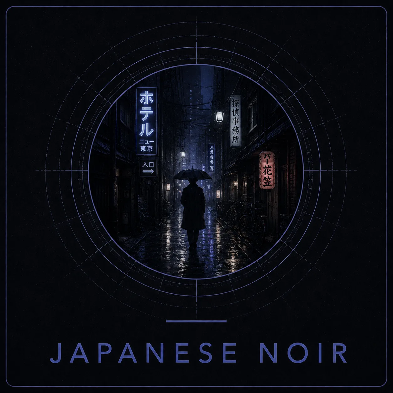
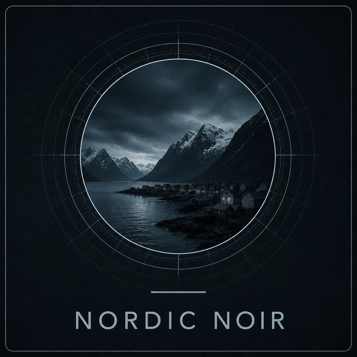
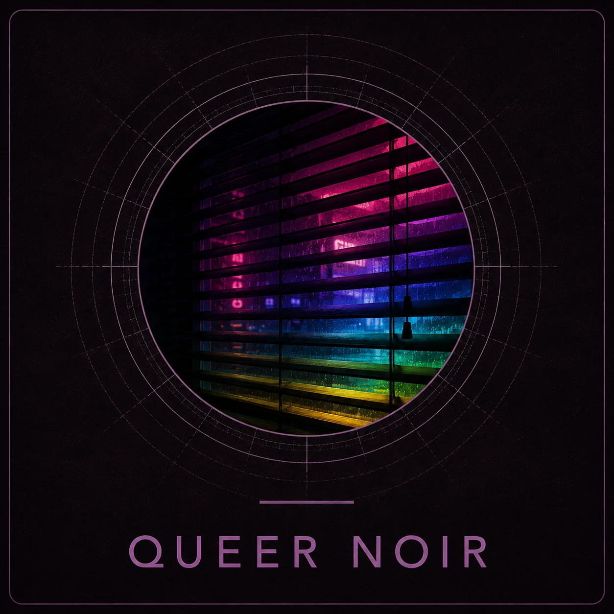
Hallucinated collections
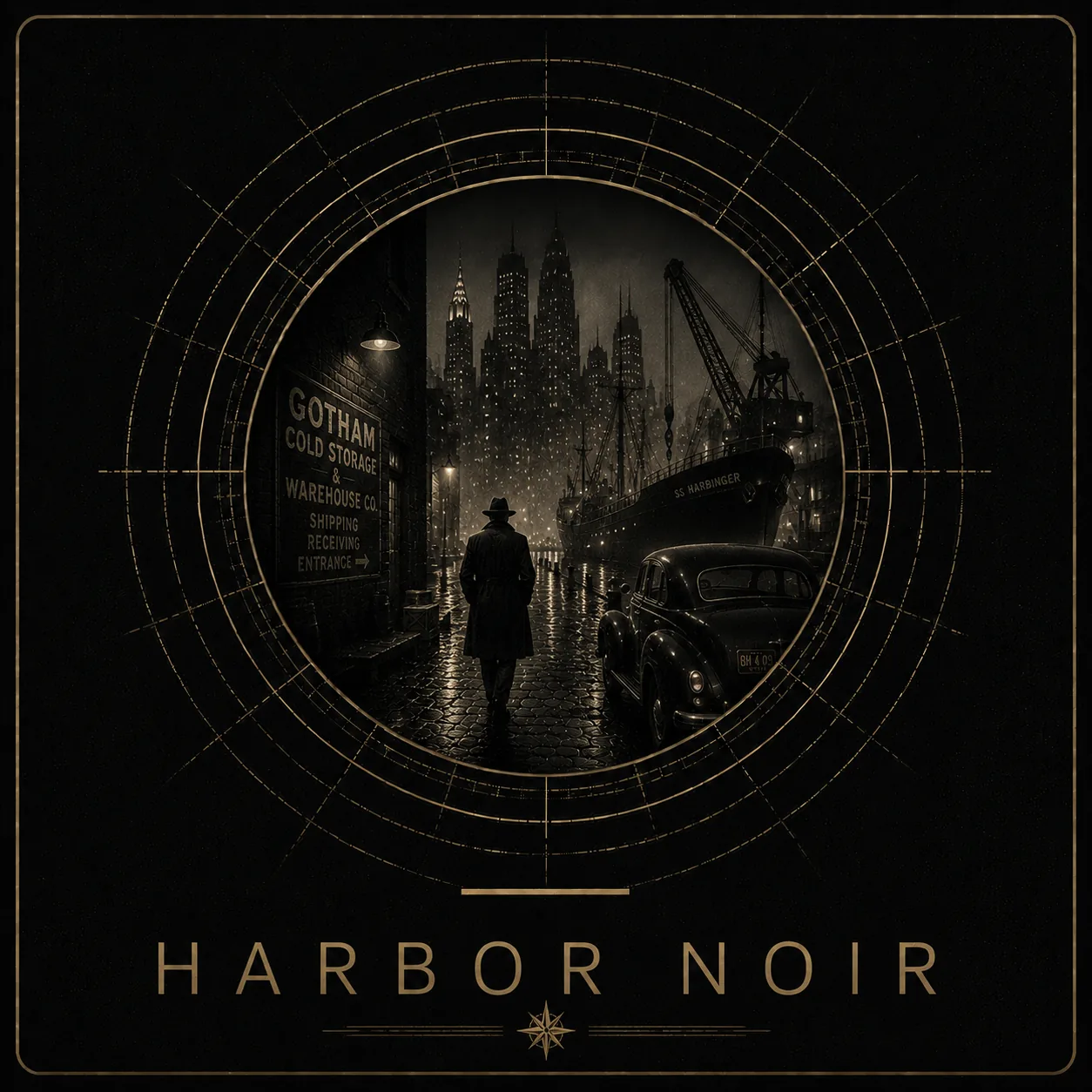

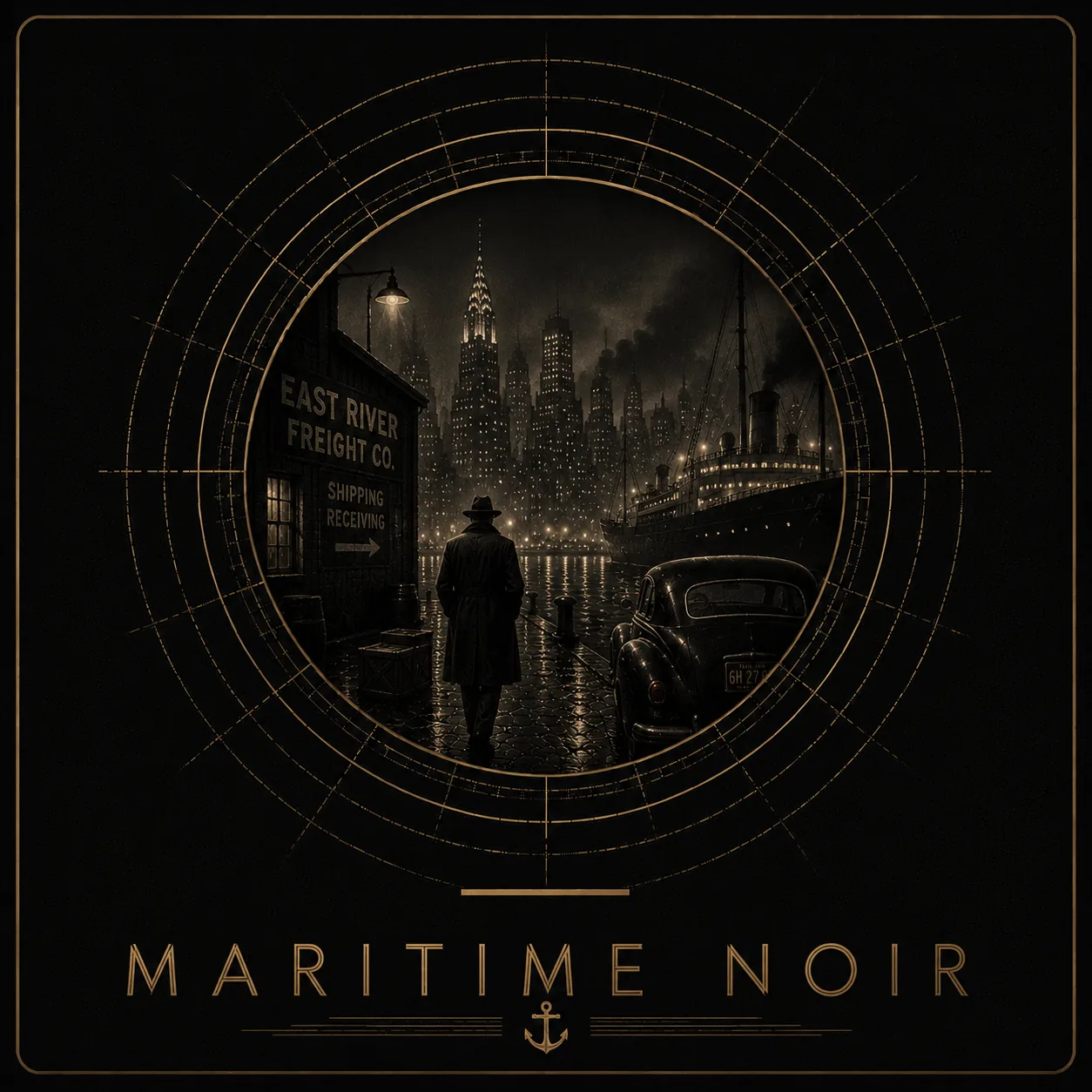
Notice the homogeneous output—the “sameness” running through everything. AI could make attractive objects. It could not decide whether those objects belonged in the system.
The thinking
Streaming services organise inventory.
Video stores organised anticipation.
Conventional UX logic says “more pages = bad.” It also says “rewarding journey = good.” To recreate the video-store experience, I needed the nearest translation of that experience in both physical and technical terms.
A video store lets you browse by feeling. It is qualitative. Streaming services treat movies as data objects and sort them by relative type. That experience is quantitative.
I chose themed collections over blunt categories. Genre matters, but subgenre, season, mood and cultural association matter too. Comedy is fine. Indefensible Stupidity is better. “Rainy-day movies” is a legitimate subgenre.
Iterations
Pretty is not the same thing as useful.
The Marvel Cinematic Universe is straightforward: arrange media by phase and put things where they logically belong. AI gave me impressive interfaces that were almost entirely unusable.
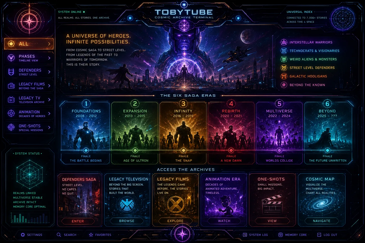
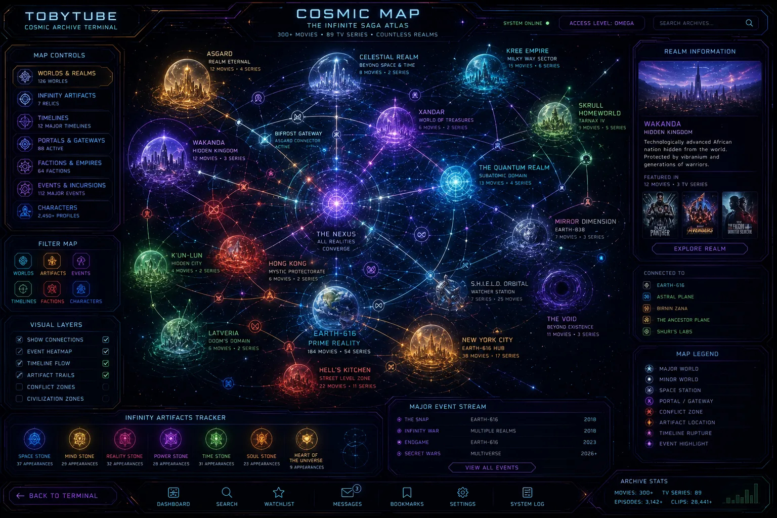
They’re utterly useless.
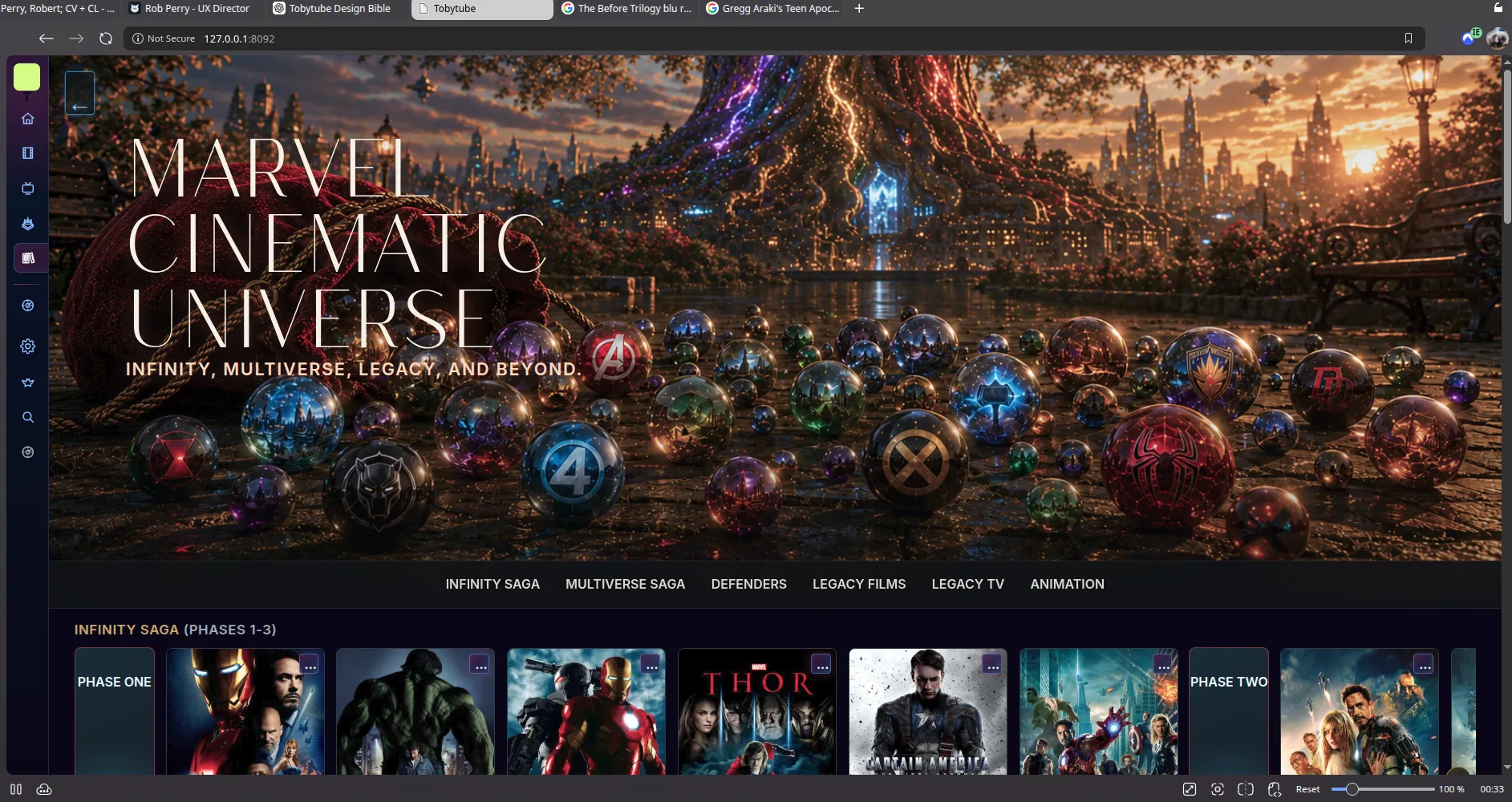
Does Phase One need its own landing page? It’s six movies—a fraction of a carousel. I put the Infinity Saga on one carousel so other angles had room to breathe. The bloated Multiverse Saga could be divided while remaining under one umbrella.
The MCU collection taught me that click-through fatigue builds just as fast as scroll fatigue—if not faster. A collection should generally remain one page. Otherwise, navigating it starts to feel like The Backrooms.
The exception
I love The Criterion Collection.
I hate The Criterion Channel.
Minimalism is fine until it feels like there’s nothing there. Criterion’s films deserved atmosphere, discovery and a little flavour.
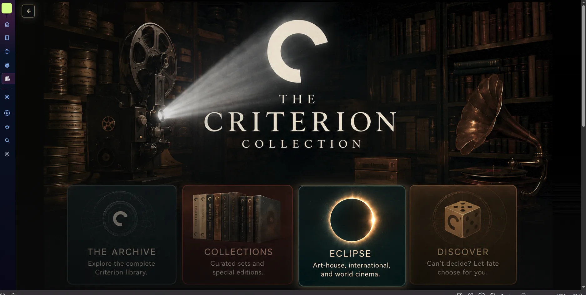
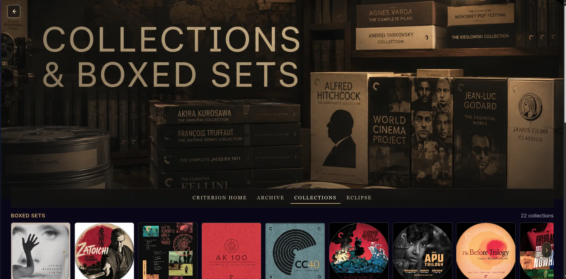
The final system
Four categories.
Thousands of ways in.
Tobytube is still in development because it’s mine. I will forever add things I want, remove things I don’t, and overhaul the visuals whenever I feel like it.
The interface is simple: a side menu, basic landing pages, and four clear categories. The work is in how the data is presented—keeping thousands of titles intuitive, legible and close at hand.
The wrestling page is ugly. This is not an award-winning design.
But you know what? It works.
It’s intuitive. It’s easy to grasp. It gets you where you need to be in a hurry. When no useful reference model existed, I built a database of professional-wrestling history and designed the model myself.
The moral of the story